Enterprise SaaS
Web App
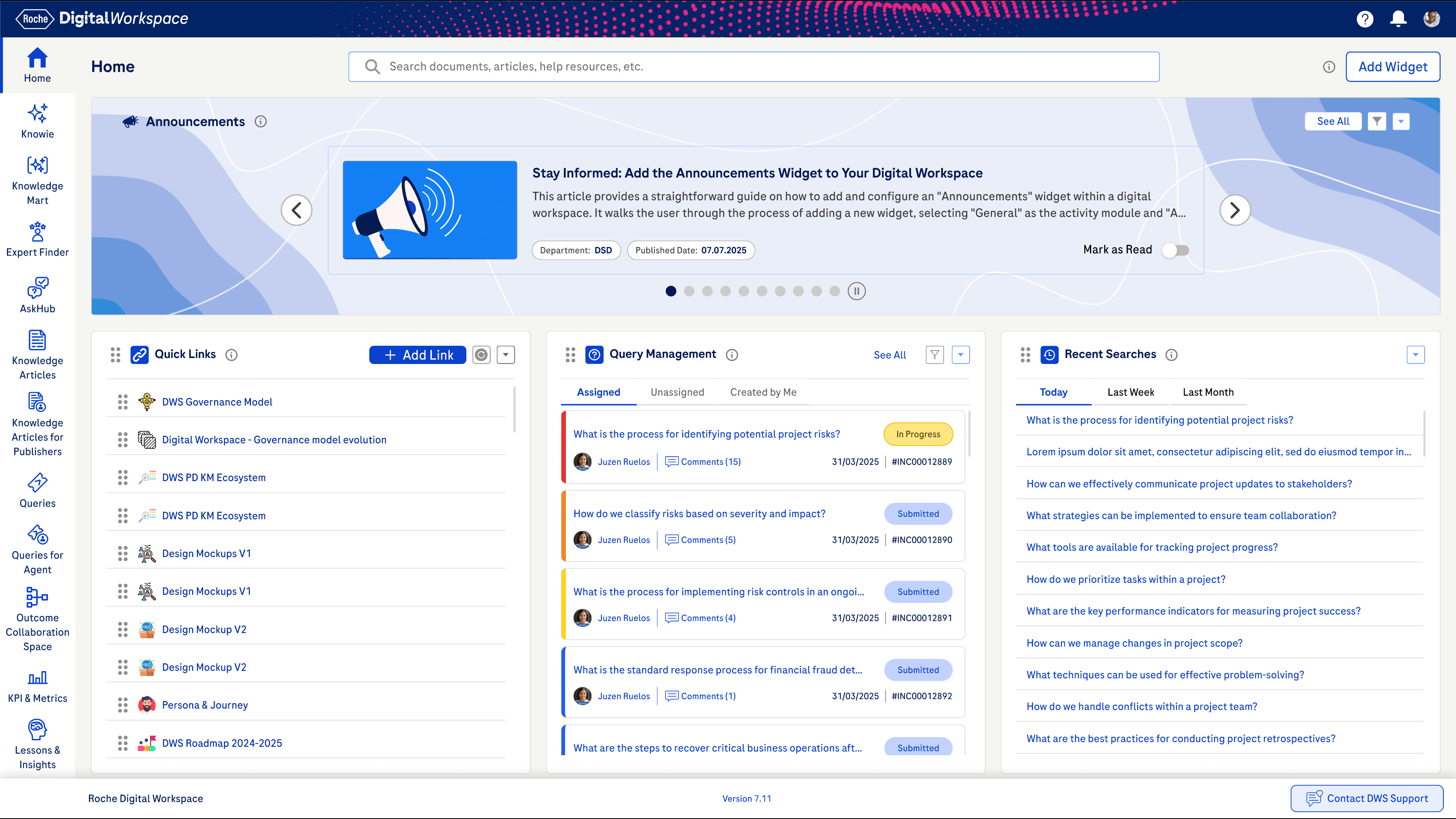
Digital Workspace - Knowledge Management
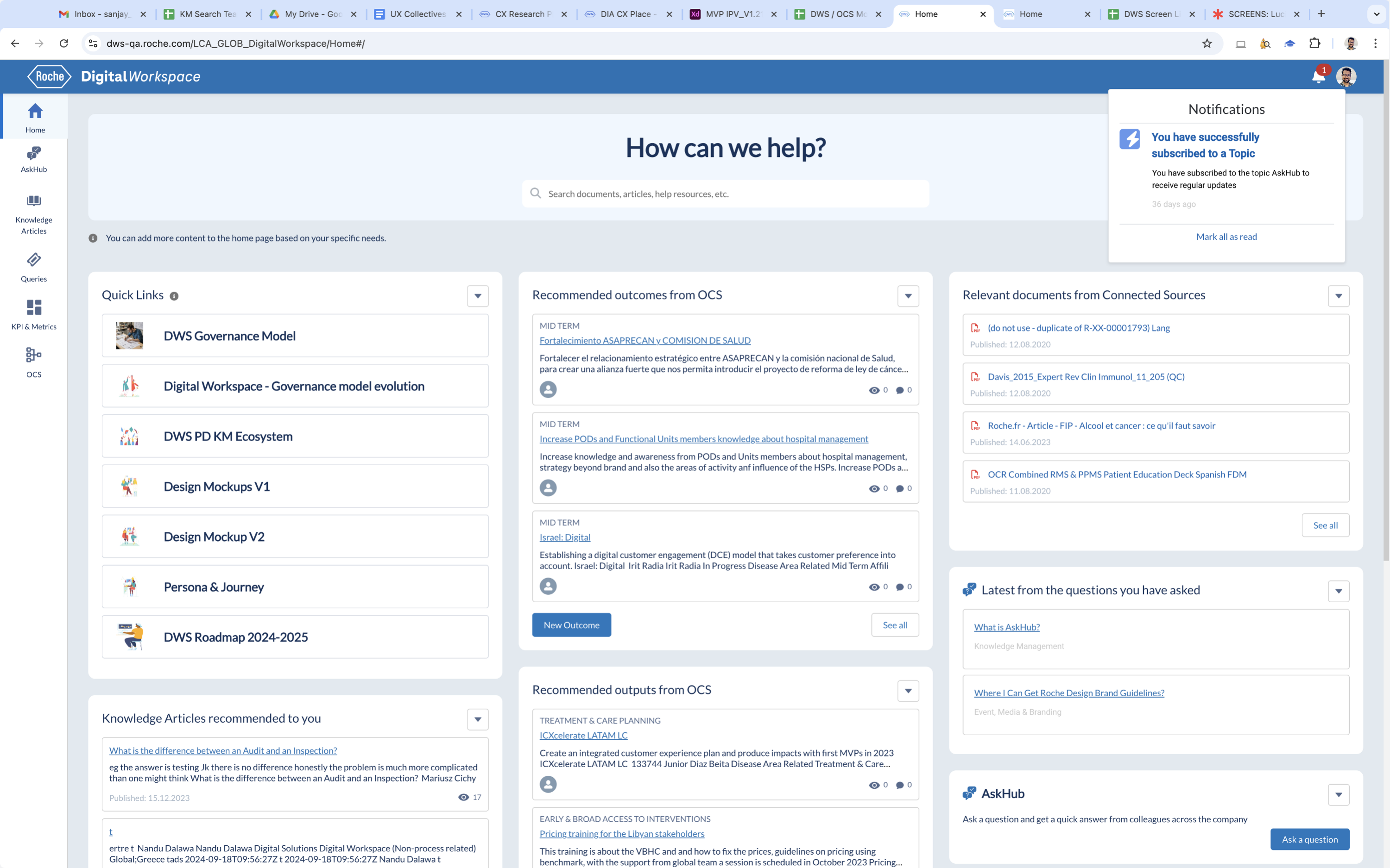
The Digital Workspace is an Al-powered platform that allows users to easily find, capture and exchange knowledge with colleagues across Roche.
Quick Usability Evaluation
Stakeholder Interviews
User Group Feedback
Concept Design
Visual Design

Stakeholder INVOLVED
24


Departments Involved
9

Total Users
7.6K

Information Structure
15

Pain Points
22

Project TEAM SIZE
20


Meeting Sessions
16


Research Hours
160


Key Insights
12
Objective
The goal of this project was to modernise the web application by transforming an outdated, uninspiring interface into a clean, engaging experience making navigation more intuitive, tasks easier to complete, and the visual language consistent and reliable across the platform.
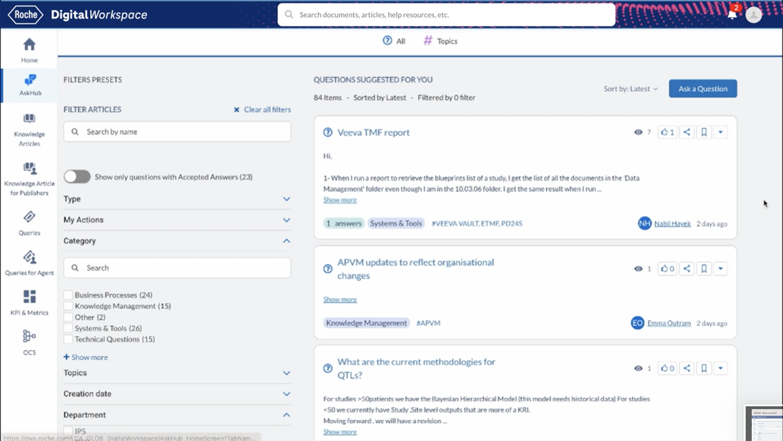
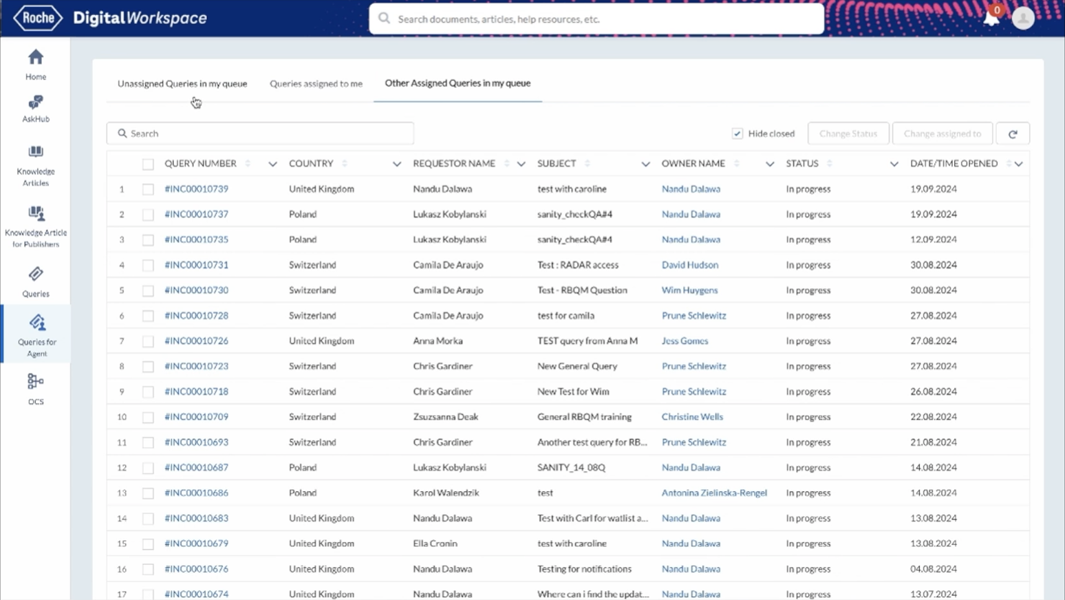
Old Screens
Covered Challenges

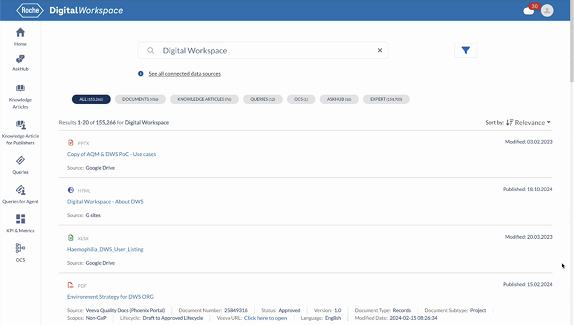
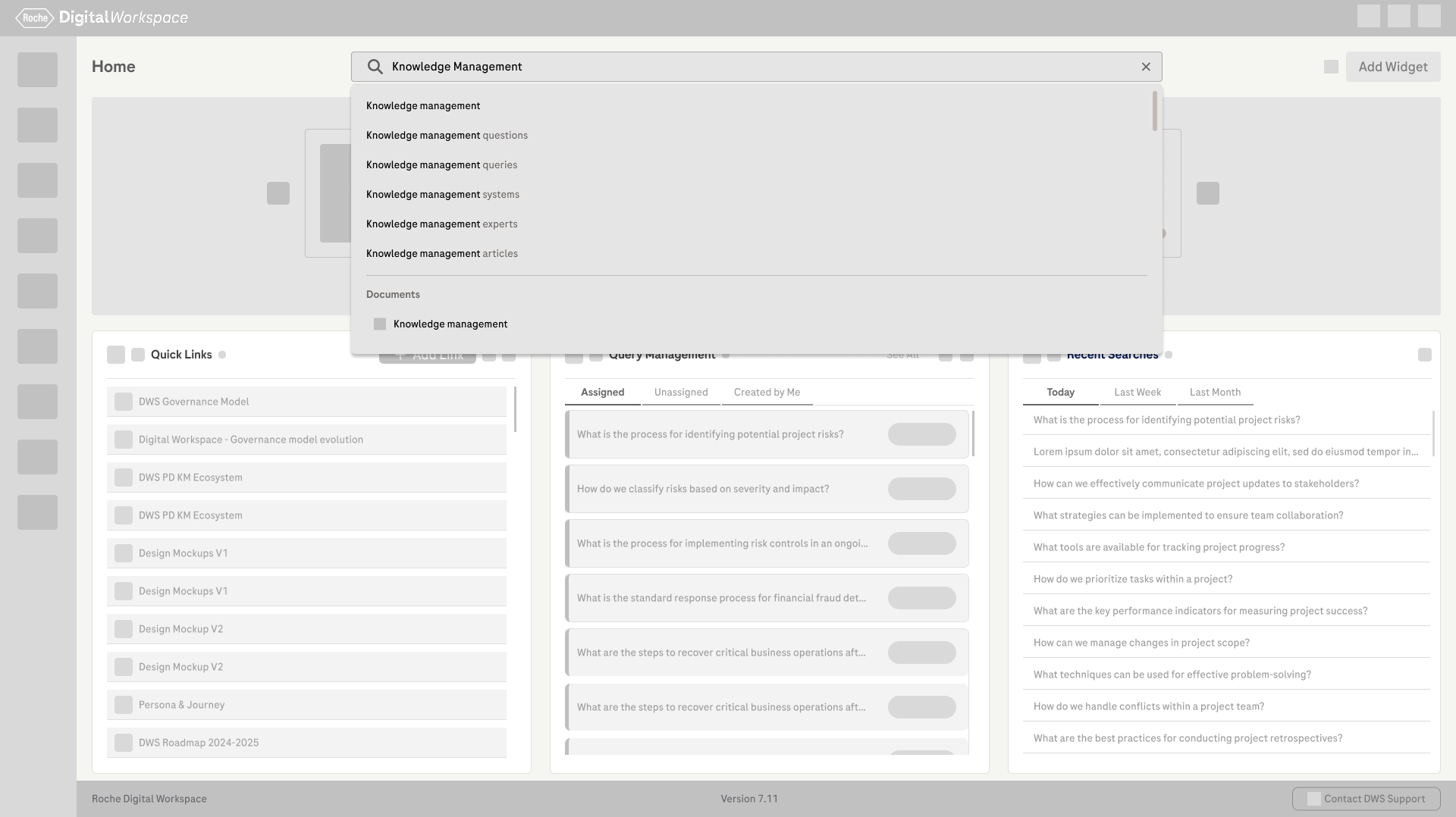
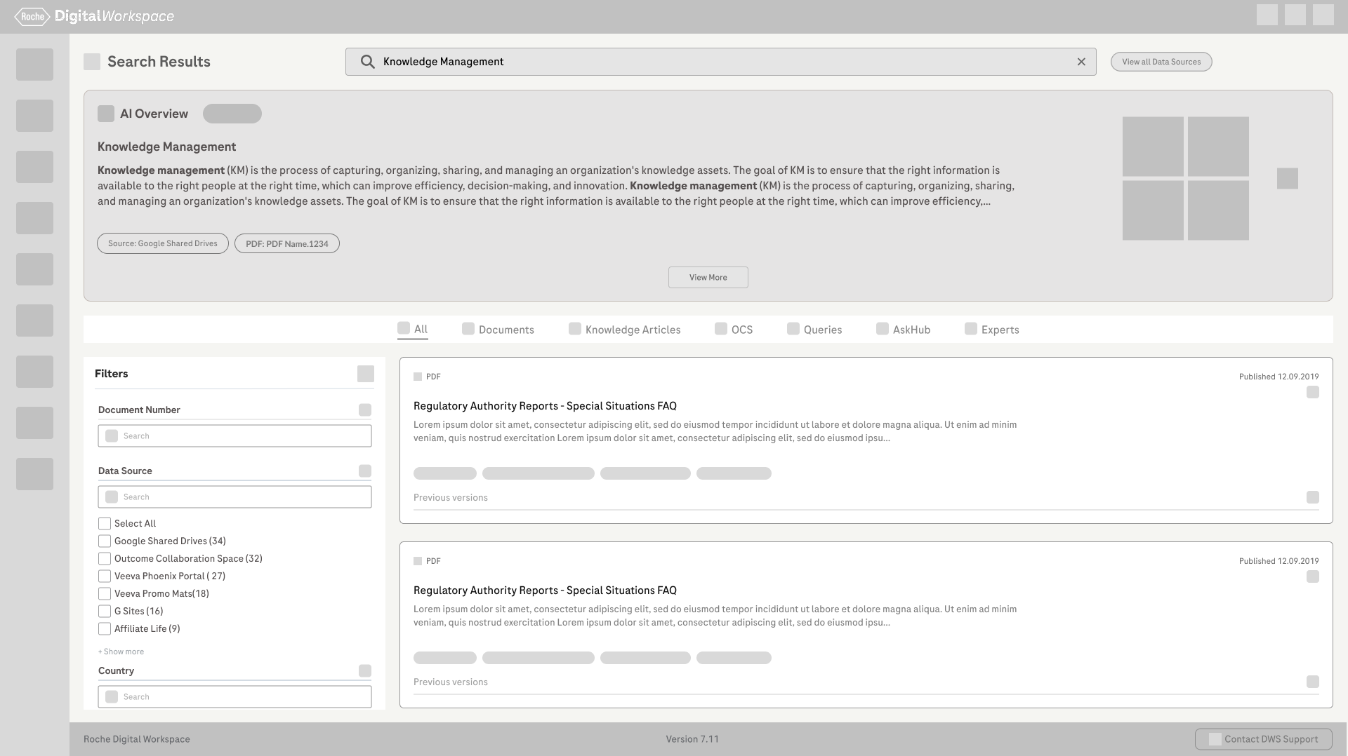
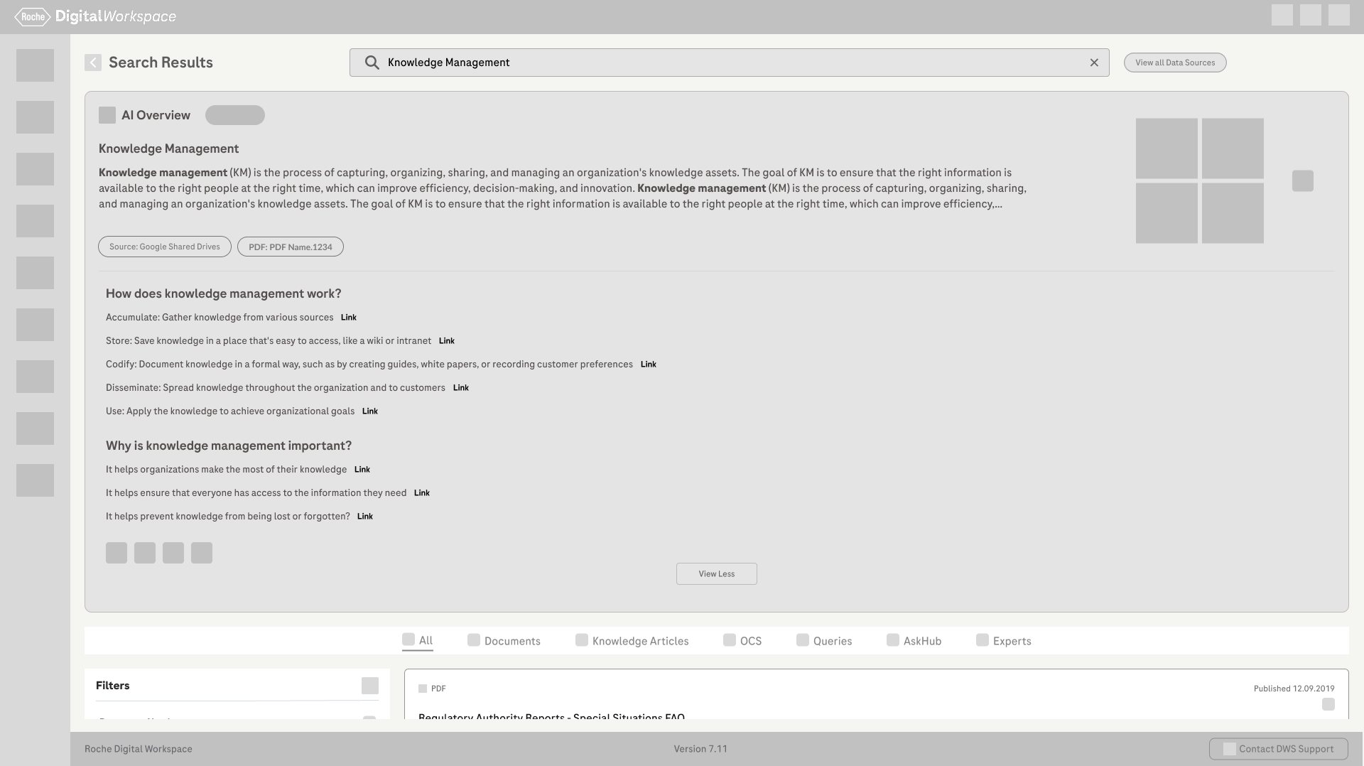
Unified Sinequa Search

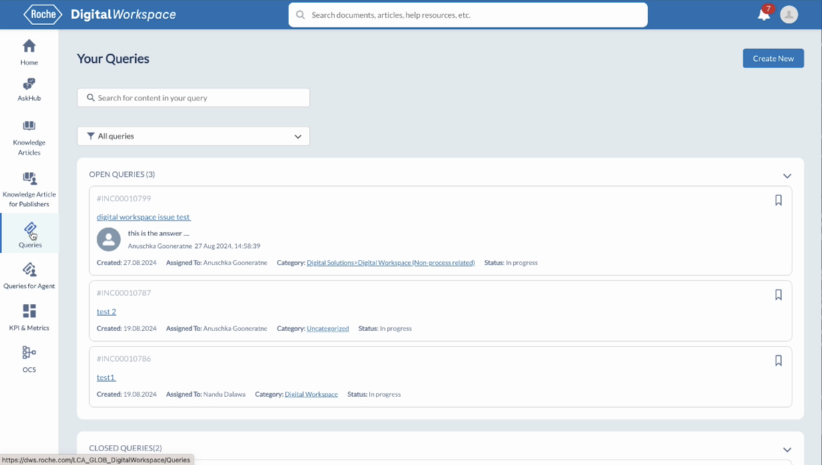
Intuitive & Engaging User Experience

Aligned KPIs & Metrics by Department
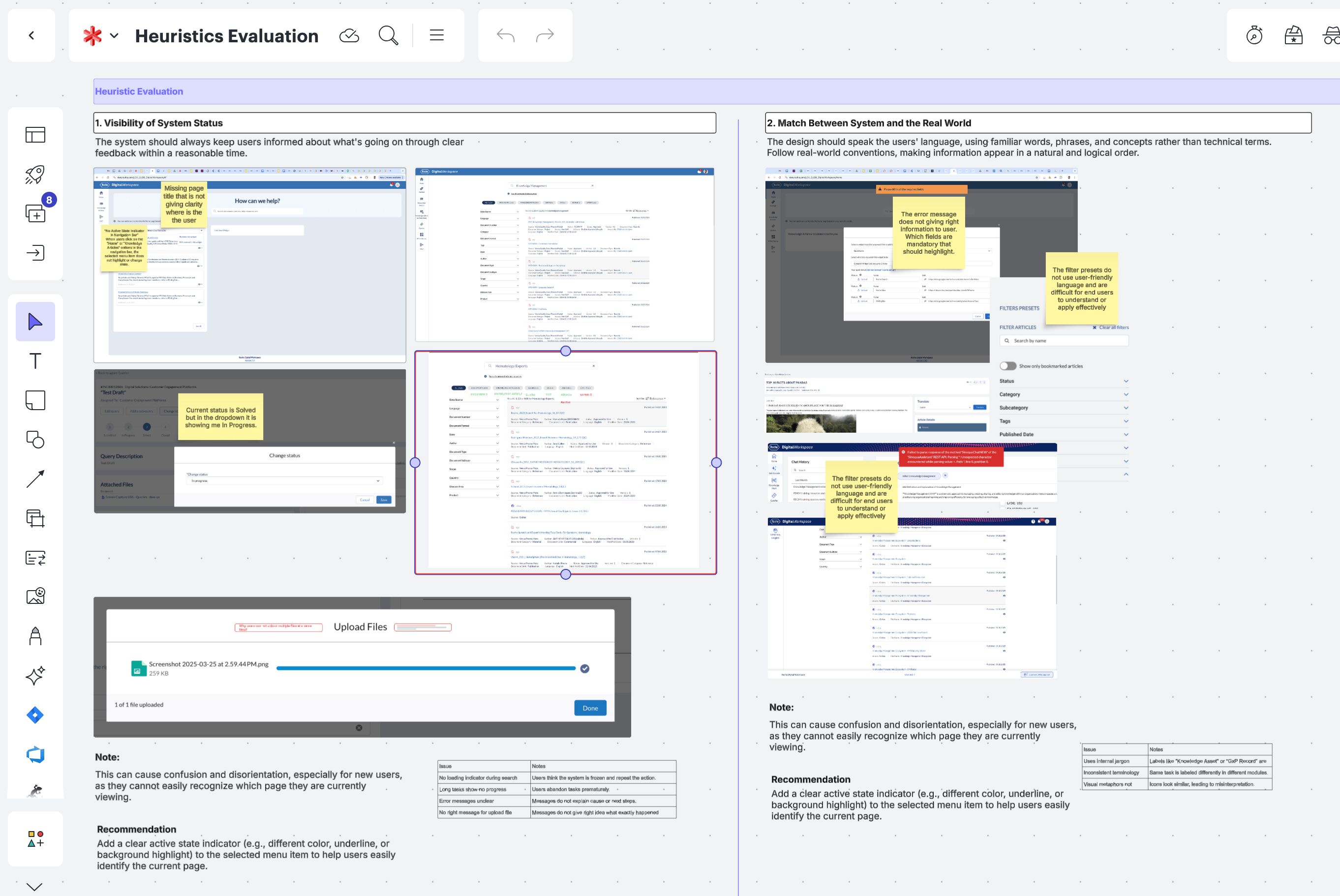
Usability Check Points
Using heuristic evaluation principles, the platform was reviewed in detail and over 100 usability observations were documented. These findings highlighted key issues related to navigation, consistency, system feedback, accessibility, and error handling, helping clearly identify where users were facing the most challenges.
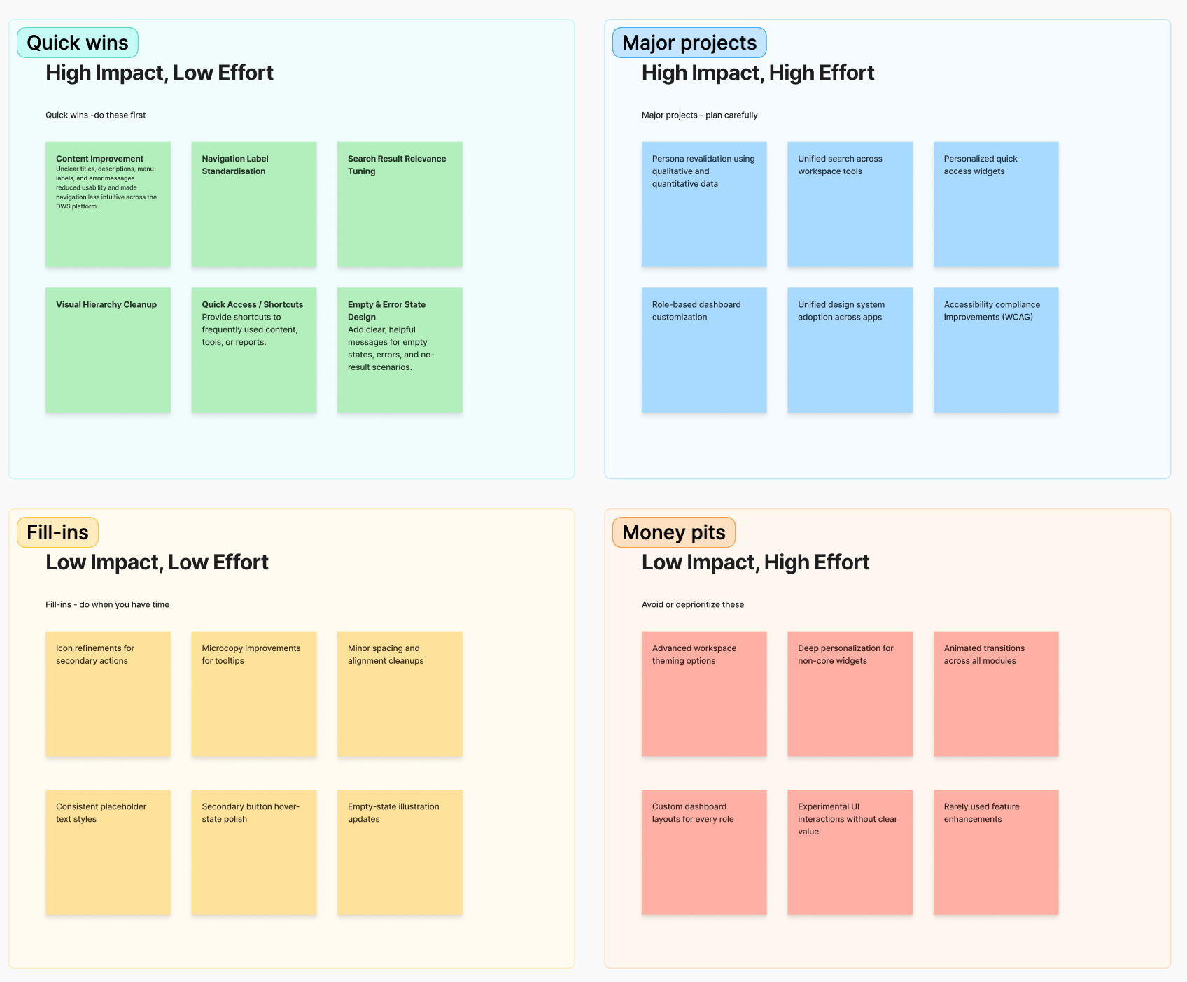
Quick Collaborative Prioritization
By having a team discussion about putting tasks in order of importance (High, Medium, Low), this helps make sure everything gets done on time and goes smoothly.
Concept Designs
For each key problem area, we explored 2–3 concept design variations. These concepts were reviewed with internal stakeholders, and through discussions and feedback, we selected the most effective direction. The chosen concepts were then refined and evolved based on usability, feasibility, and business needs.
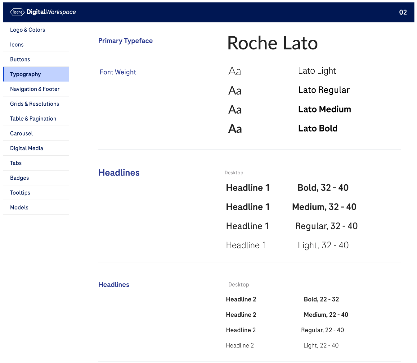
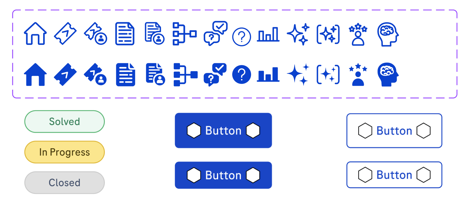
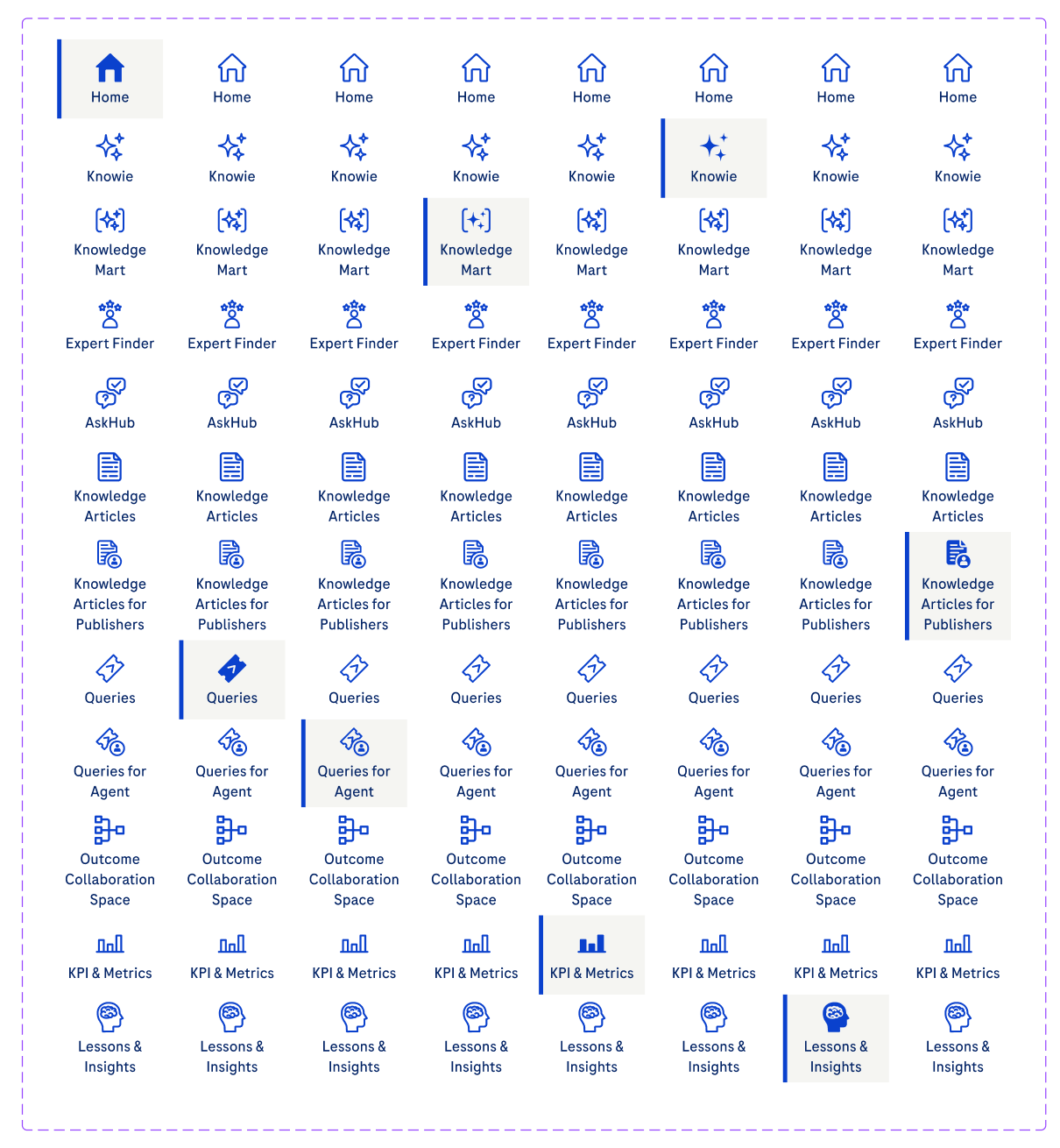
Design Guidelines
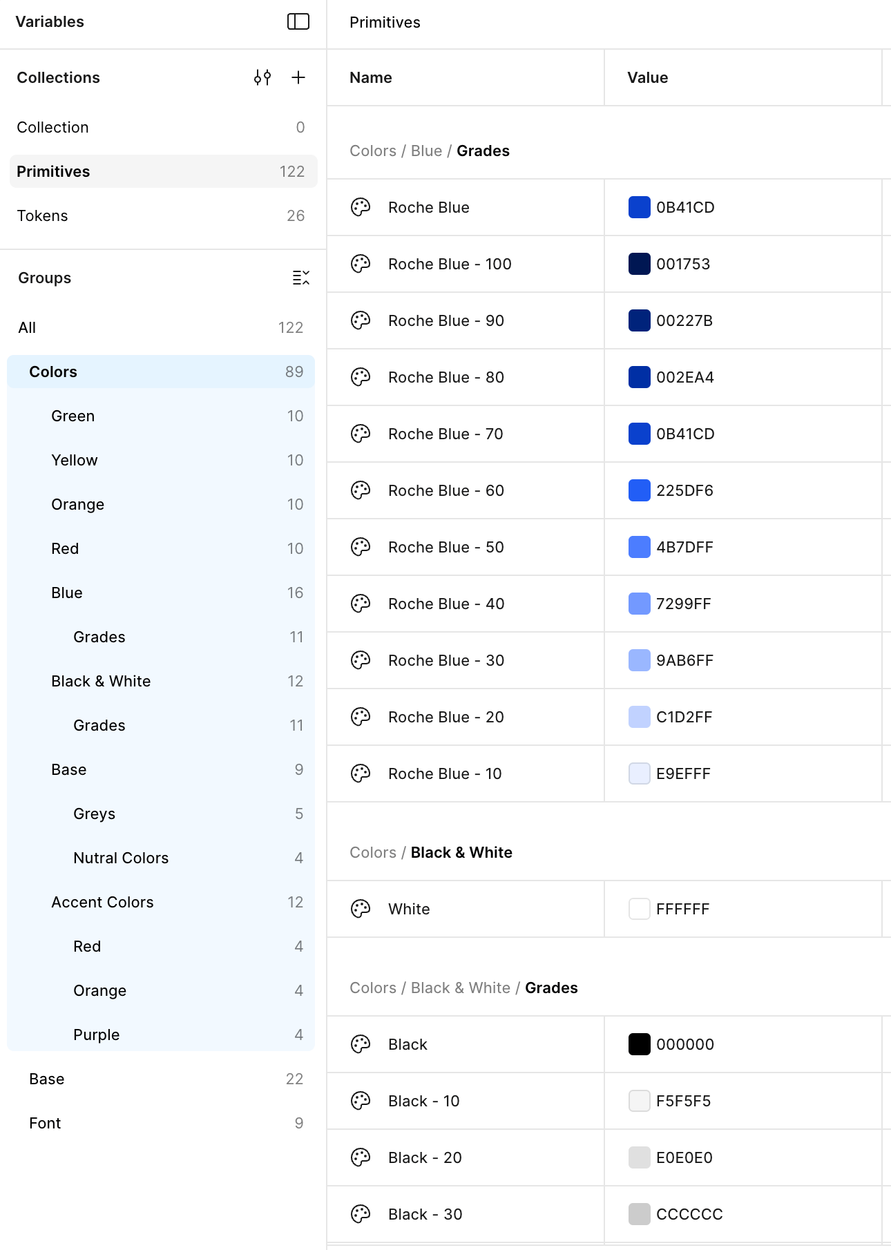
To ensure consistency across the platform, we established clear design guidelines covering grids, color usage, typography, iconography, and UI components such as buttons and form elements. These guidelines helped create a cohesive visual language and made it easier to scale and maintain the design across future updates.
Revamped Visual Designs
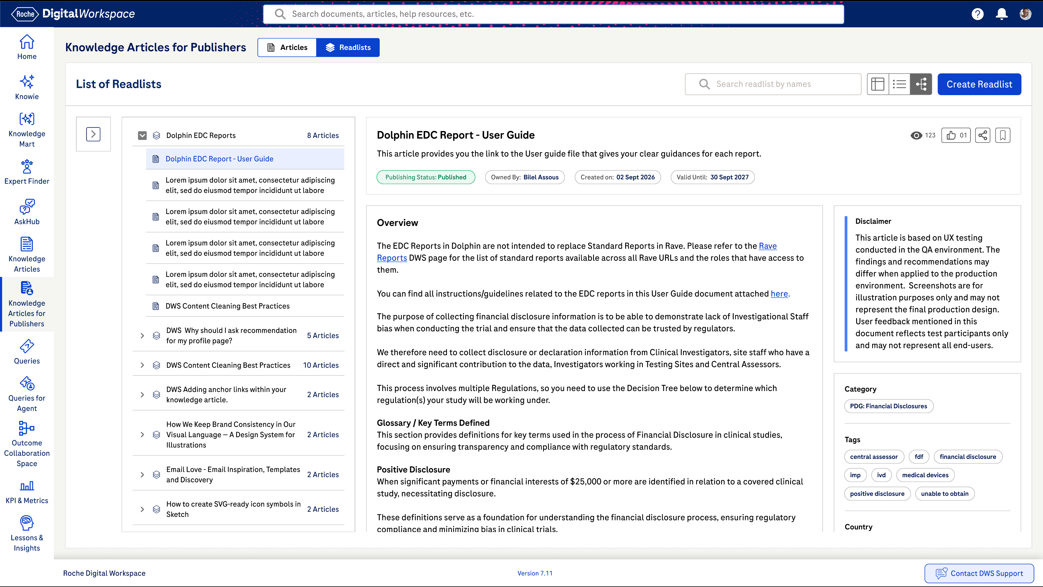
The final designs reflected a cleaner, more modern interface with improved hierarchy, spacing, and clarity. Changes were implemented incrementally through an agile process, with new features and improvements introduced in parallel based on the agreed roadmap.
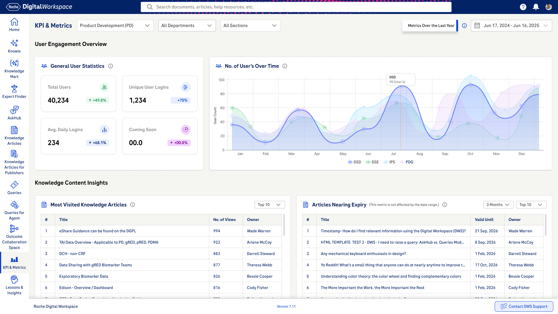
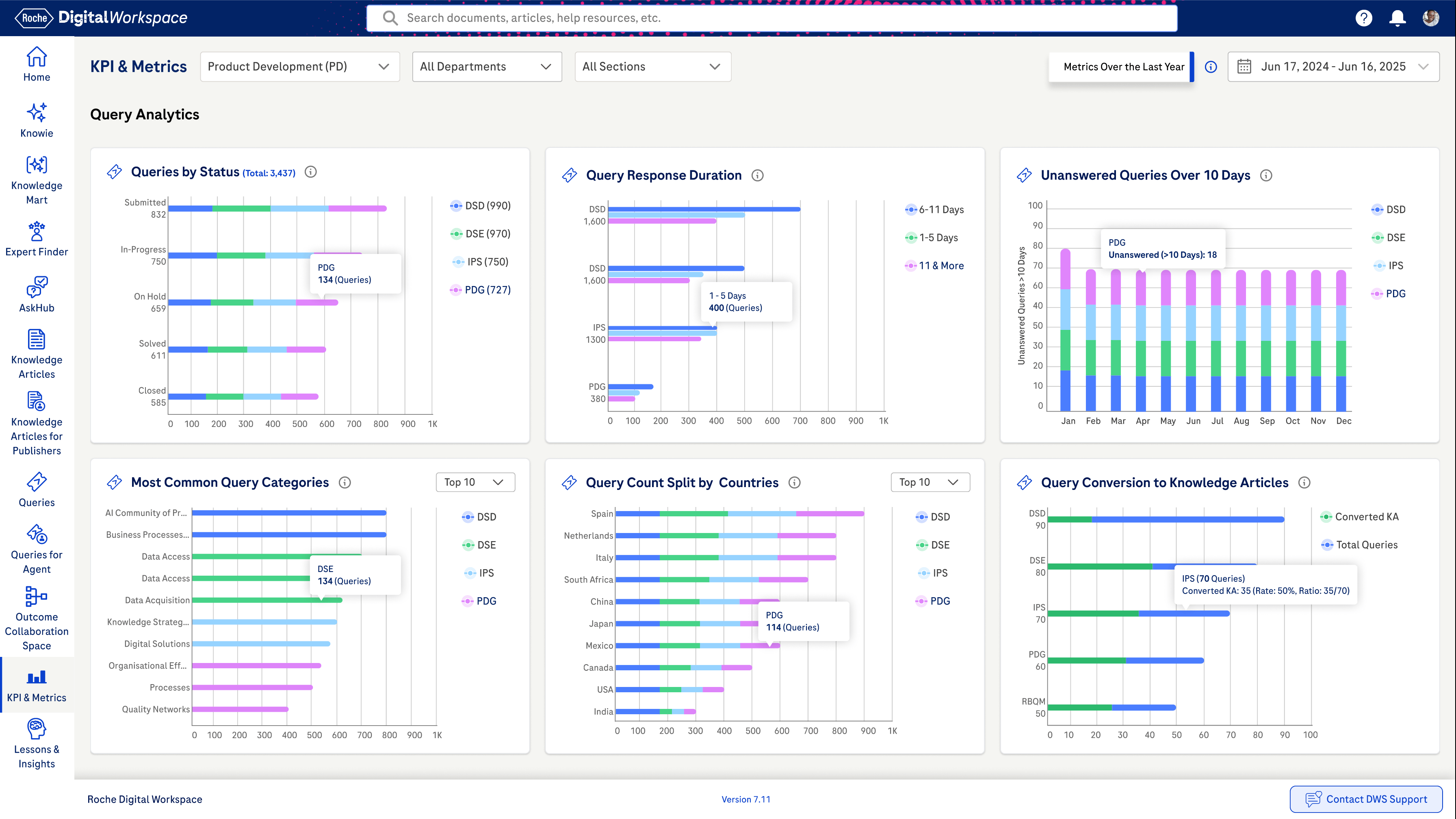
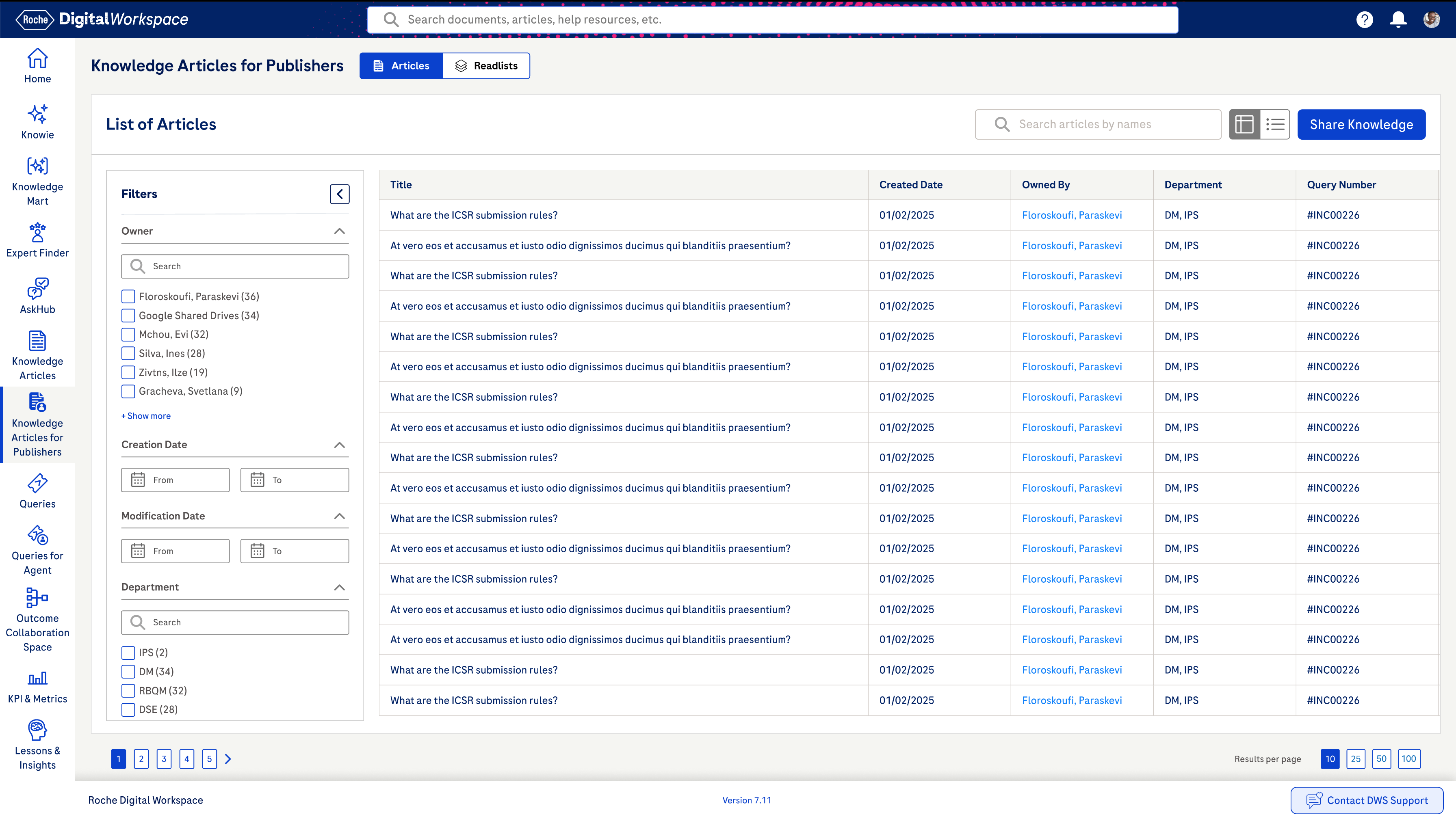
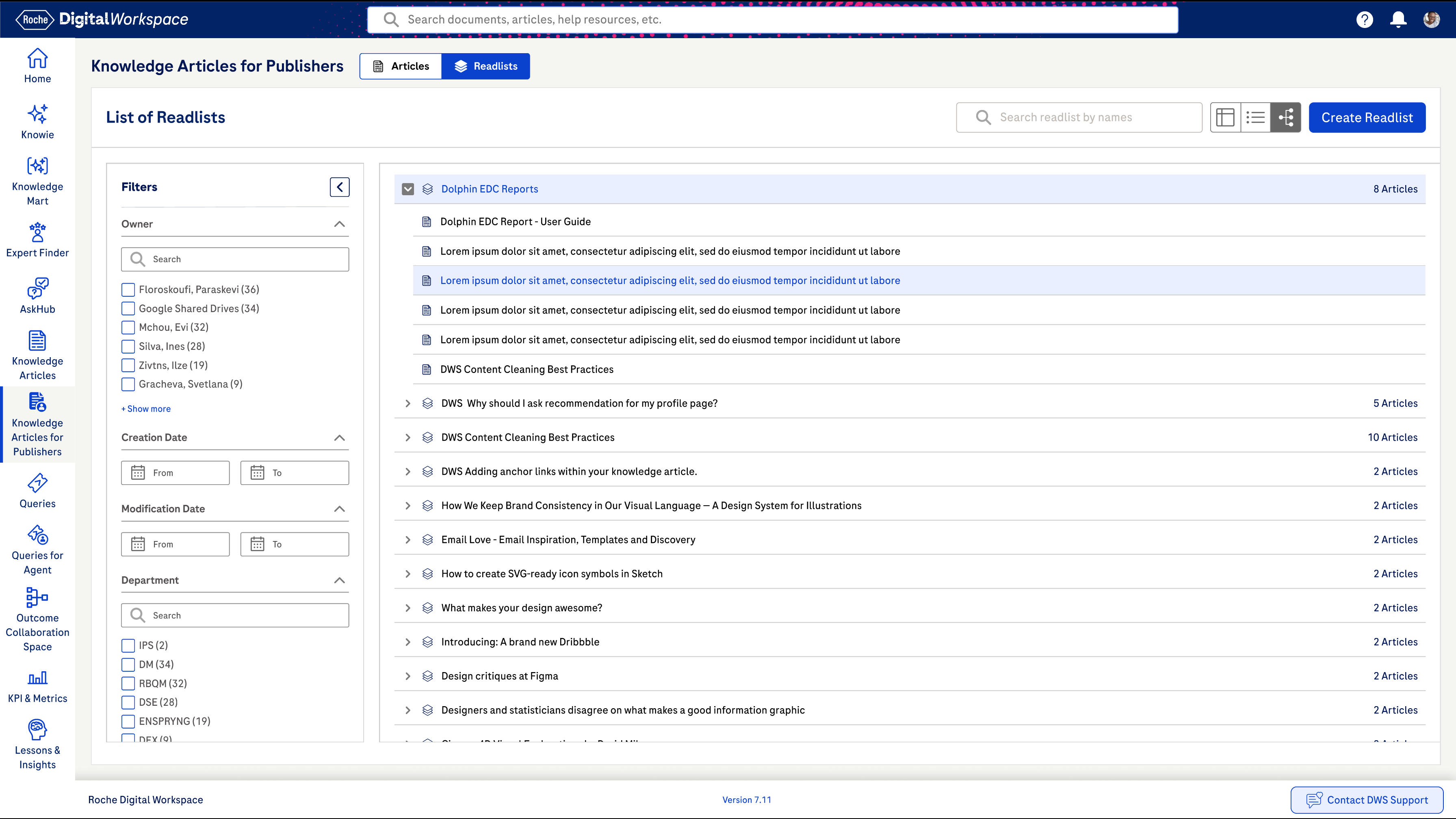
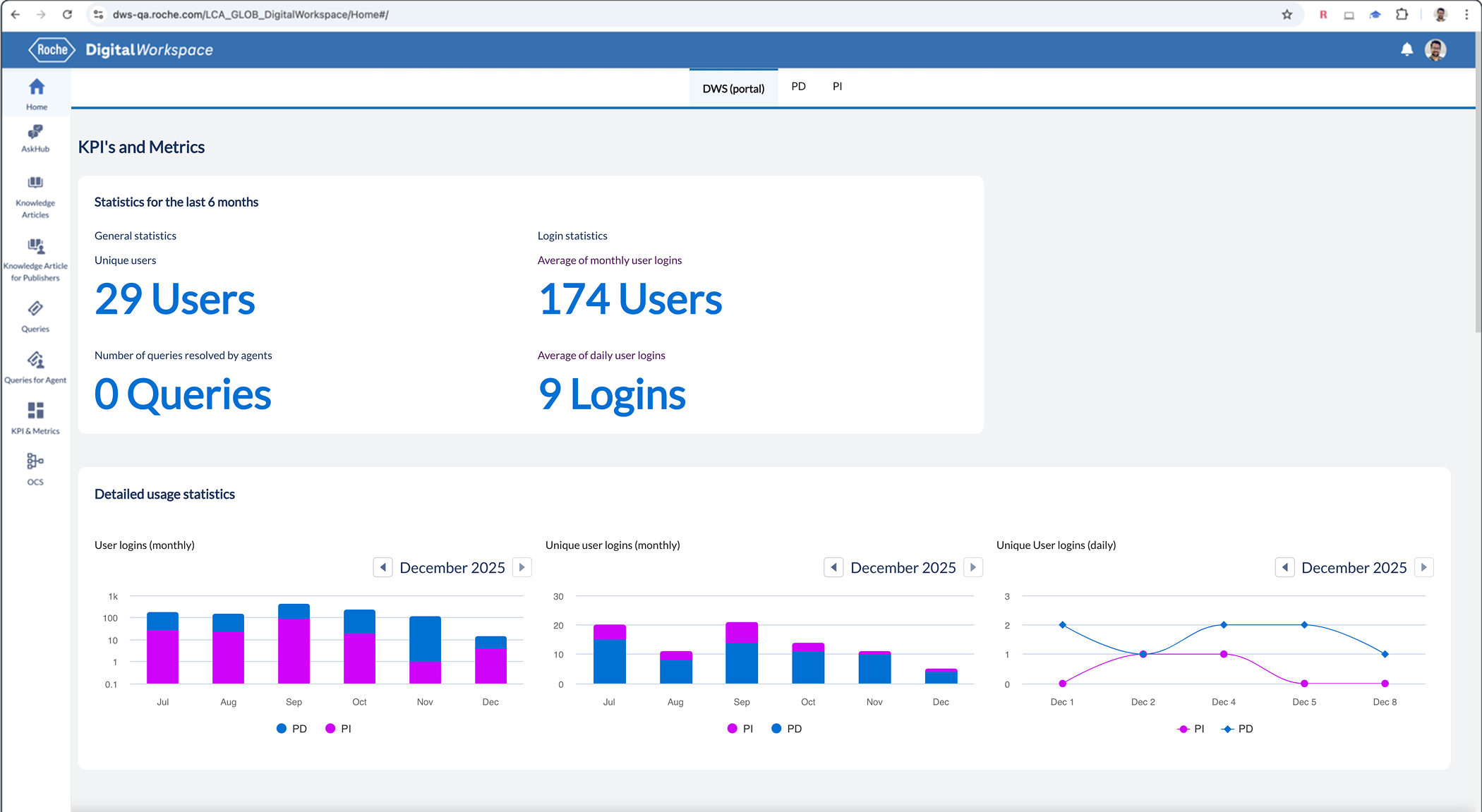
Redesign Impact (Measured & Observed)
The redesigned experience improved content discoverability, reduced user effort, and increased confidence in the platform. Users could find information faster, understand content more clearly, and navigate the system with greater ease. The structured approach also supported better governance and set a strong foundation for future enhancements.
Search Success Rate
+42%
Reduction in Support Requests
+32%
Reduction in Training Time
45%
Awards & User Highlights
This overview provides a high-level glimpse of the project. I’d be happy to walk through the details and discuss it further in a dedicated call.
Enterprise SaaS
Web App
Digital Workspace - Knowledge Management
The Digital Workspace is an Al-powered platform that allows users to easily find, capture and exchange knowledge with colleagues across Roche.
Quick Usability Evaluation
Stakeholder Interviews
User Group Feedback
Concept Design
Visual Design
Stakeholder INVOLVED
24
Departments Involved
9
Total Users
7.6K
Information Structure
15
Pain Points
22
Project TEAM SIZE
20
Meeting Sessions
16
Research Hours
160
Key Insights
12
Objective
The goal of this project was to modernise the web application by transforming an outdated, uninspiring interface into a clean, engaging experience making navigation more intuitive, tasks easier to complete, and the visual language consistent and reliable across the platform.
Old Screens
Covered Challenges
Unified Sinequa Search
Intuitive & Engaging User Experience
Aligned KPIs & Metrics by Department
Usability Check Points
Using heuristic evaluation principles, the platform was reviewed in detail and over 100 usability observations were documented. These findings highlighted key issues related to navigation, consistency, system feedback, accessibility, and error handling, helping clearly identify where users were facing the most challenges.
Quick Collaborative Prioritization
By having a team discussion about putting tasks in order of importance (High, Medium, Low), this helps make sure everything gets done on time and goes smoothly.
Concept Designs
For each key problem area, we explored 2–3 concept design variations. These concepts were reviewed with internal stakeholders, and through discussions and feedback, we selected the most effective direction. The chosen concepts were then refined and evolved based on usability, feasibility, and business needs.
Design Guidelines
To ensure consistency across the platform, we established clear design guidelines covering grids, color usage, typography, iconography, and UI components such as buttons and form elements. These guidelines helped create a cohesive visual language and made it easier to scale and maintain the design across future updates.
Revamped Visual Designs
The final designs reflected a cleaner, more modern interface with improved hierarchy, spacing, and clarity. Changes were implemented incrementally through an agile process, with new features and improvements introduced in parallel based on the agreed roadmap.
Redesign Impact (Measured & Observed)
The redesigned experience improved content discoverability, reduced user effort, and increased confidence in the platform. Users could find information faster, understand content more clearly, and navigate the system with greater ease. The structured approach also supported better governance and set a strong foundation for future enhancements.
Search Success Rate
+42%
Reduction in Support Requests
+32%
Reduction in Training Time
45%
Awards & User Highlights
This overview provides a high-level glimpse of the project. I’d be happy to walk through the details and discuss it further in a dedicated call.